The Coin Color Illusion: Simultaneous Contrast in Numismatics
By Denis Richard, Coin Photography Studio
March 11, 2025
7-minute read
A coin collector gingerly places a shining silver coin on black velvet and marvels at its brilliance. Later, on a white tray, the same coin seems to lose a touch of its luster. It isn’t imagination – it’s a quirk of vision known as simultaneous contrast, a color theory discovery that’s as relevant to coins as it is to art. In the 19th century, scientists uncovered how colors can deceive the eye when seen side by side. Today, seasoned numismatists and casual collectors alike are learning how this phenomenon can affect the way we design and display our treasured coins.

A 19th-Century Discovery of Color Contrast
The story of simultaneous contrast begins in a French tapestry factory. In 1839, chemist Michel Eugène Chevreul was tasked with improving “murky” dye colors at the Gobelins manufactory in Paris. After careful study, Chevreul realized nothing was wrong with the dyes at all – instead, the colors of yarn appeared dull or vibrant depending on the neighboring hues. He famously concluded that it was “not the dyes, but the placement of colors next to one another, that made them appear more or less vibrant”. Chevreul distilled his observations into the Law of Simultaneous Contrast of Colors, noting that when “two colors [are] placed side by side [they] will appear to change in hue, tonal value, and saturation; their dissimilar qualities [are] intensified and similar qualities muted”. In other words, a color appears to shift toward the complementary of its neighbor in terms of hue and darkness. This revelation rocked the art and design world of the time – painters, illustrators, and artisans now had a scientific explanation for why certain color combinations seemed to pop.
Right: Michel Eugene Chevreul. Unknown date, but he died in 1889.

Why Colors Deceive the Eye
In this classic optical illusion, the two dogs are the same shade – yet one looks lighter and the other darker due to the shifting background. Our visual system constantly compares adjacent areas, tricking us into seeing colors and brightness relative to their surroundings.

The two brown blocks are the same colour, though one appears bright orange.
Modern vision science attributes this physiological phenomenon to how our eyes and brain emphasize contrasts: neurons in the eye fire intensely at edges where light and dark meet, while more uniform areas get less attention. In everyday terms, our perception of color is easily swayed by context. A mid-tone coin can appear different against a dark display versus a light one – the eye automatically boosts the contrast. This simultaneous contrast effect can make a silver-gray coin look almost white on a black background, or slightly dull on a bright white background, all because of the surrounding hues. It’s a reminder that seeing isn’t always believing, and even the most trained observer can be fooled by these color games.

From Palette to Mint: Contrast in Coin Design
Coin designers have long used contrast – in color, tone, and finish – to enhance a coin’s artistry. While most circulating coins aren’t brightly colored, many feature contrasting metals or finishes that apply the same principle.

Even monochromatic coins take advantage of contrast: mints often use polished mirror fields and frosted relief on proof coins to make the design pop through contrasting lightness.

Collectors of vintage coins see a similar effect with natural toning. A rainbow-toned Silver dollar with bands of colour will seem to glow – each color intensified by its neighbor’s complementary hue. In essence, the coin itself can be a canvas of simultaneous contrast, where adjacent shades of metal and patina amplify each other.
Showing Coins in Their Best Light
Understanding simultaneous contrast isn’t just academic – it has practical payoffs for how coins are presented. Collectors, photographers, and museums all use background choices and lighting strategically once they realize how much context matters.

Various platinum coins and packaged PAMP bar, against a complimentary blue/grey background.
A common tip: choose a display or photo background that contrasts with the coin’s color. For example, a richly toned silver coin with dark patina will look brighter on a light background, whereas an untoned brilliant coin can gleam more on black. White backdrops tend to flatter colorful tarnish, while black backdrops flatter bright, reflective silver. The same idea guides museum exhibit design. Exhibit builders often avoid putting bronze coins on reddish fabric (which would make their brown tones blend in); instead, they opt for a neutral beige or pale grey, so the coin’s features stand out. In fact, experienced collectors recommend using “a color opposite to that of most of your coins so there’s contrast.” By tweaking the surrounding colors – whether the lining of a display case or the color of a showcase wall – curators ensure each coin’s true colors shine. Lighting plays a role as well: a slight adjustment in bulb warmth or direction can either mask or magnify the subtle tones on a coin’s surface. The goal is to avoid any unintended optical illusions that would distort how a coin is perceived.

In professional coin grading, too, presentation is key.
In the late 1980s, Numismatic Guaranty Company (NGC) experimented with stark black coin holders to make gold coins look elegant but found that copper and silver pieces appeared less impressive against black. They soon switched to a white holder insert, which “enhances each coin’s brilliance” for a more balanced display. This move acknowledged that the background color of a holder can alter a coin’s visual impact – a direct application of simultaneous contrast insight.
A Timeless Contrast
From Chevreul’s 19th-century textile workshop to the modern coin cabinet, the science of simultaneous contrast has proven to be a timeless tool. It’s remarkable that a principle first described in 1839 to explain dull tapestry colors is now helping numismatists present gleaming gold and silver to best effect. Whether you’re a casual visitor at a museum exhibit or a dedicated collector arranging coins at home, you’ve likely been unwittingly influenced by this color phenomenon. The next time a coin’s design strikes you as particularly vivid or its metal seems to glow, take a second look at the context – the background, the lighting, the adjacent colors. You might realize that the coin’s beauty isn’t just in the coin itself, but also in the delicate interplay of light and color around it. Simultaneous contrast reminds us that seeing a coin is a dynamic experience: our eyes are constantly comparing, adjusting, and, in a way, creating the colors we think we observe. And for numismatics, a field that bridges art, history, and science, that bit of optical magic only adds to the allure. Each coin, small as it is, carries not just the weight of currency but the legacy of color theory – a shining example of art and science striking an illuminating balance.
Tips for Choosing Complementary Background Colors for Coin Displays
Selecting the right background colour for coin displays—whether for a collection, photography, or online sales—makes a significant difference in how the coin is perceived. The principle of simultaneous contrast teaches us that a coin’s colour, tone, and details are influenced by the surrounding hues. Below are some guidelines to ensure coins are presented in the best possible way:
1. Silver and White Metal Coins (Silver, Platinum, Palladium, Nickel-Alloyed Coins)
Best Backgrounds: Black, deep blue, dark gray, or rich burgundy
Why? Darker backgrounds enhance the brightness and reflectivity of silver coins, making their luster pop. A rich blue or burgundy can add warmth and contrast without overpowering the metal’s natural sheen.
Avoid: White or very light backgrounds, as they can make silver coins appear less vibrant.

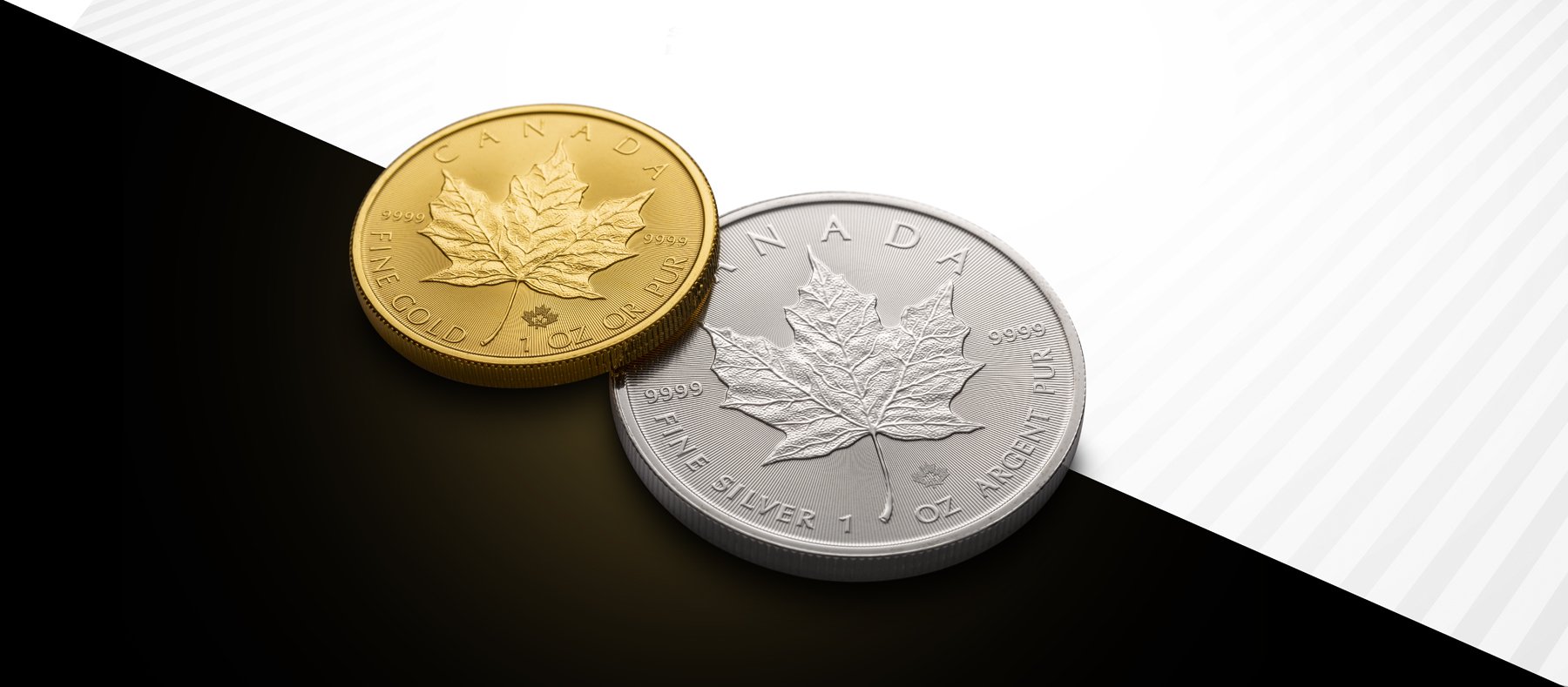
A small stack of Canadian 1oz Silver Maple Leafs.
2. Gold Coins (Yellow Gold, Rose Gold, Electrum, Bronze-Toned Gold)
Best Backgrounds: Deep green, navy blue, dark brown, or royal purple
Why? Gold contrasts beautifully with cool, rich tones like blue and green, emphasizing its warmth. Deep brown can also create a classic, elegant appearance.
Avoid: Orange or yellow backgrounds, as they blend too closely with gold’s natural hue and reduce contrast.

1 oz gold bar in packaging.

Royal Mint, 500th anniversary of the first Gold Sovereign, 1489-1989.
3. Copper and Bronze Coins (Ancient Coins, Large Cents, Tokens)
Best Backgrounds: neutral colors like white, beige, or gray to create a harmonious and sophisticated look. Use complementary colors such as teal or navy blue to make the copper stand out.
Why? Copper and bronze often have rich, earthy patinas that can be complemented by cool or neutral tones like gray or blue. Dark green brings out the reddish warmth in copper.
Avoid: Red, orange, or brown backgrounds, as they make copper coins blend in rather than stand out.

1988 square 5 cent copper-plated steel coin of Suriname.

1998 Belgian 50 centimes coin. Adding a vignette around the background draws the eye to the subject. A portrait of a Belgian coal miner, wearing a leather helmet. The design of this bronze coin was inspired by the sculptures of miners by Constantin Meunier.
4. Bimetallic Coins (Gold/Silver, Copper/Nickel, or Modern Circulating Bimetallic Coins)
Best Backgrounds: Dark blue, black, or deep green
Why? These colors balance the contrast between the two metals, allowing both tones to stand out without one overpowering the other.
Avoid: Medium-toned grays, which may make the two metal tones appear muddled rather than distinct.

Modern bi-metallic coins deliberately pair two different metal alloys for visual impact. The silver outer ring and golden-hued center, for instance, each look more distinct and vibrant because they’re side by side. This is Chevreul’s law in action – the warm gold tones appear richer against the cool silver, and vice versa, so the design details stand out crisply.
5. Toned Coins (Rainbow Toning, Blue Toning, Purple Toning on Silver Coins)
Best Backgrounds: Dark gray, black, or deep navy blue
Why? A dark neutral background amplifies the vibrancy of colorful toning, making blues, purples, and reds appear more intense.
Avoid: Bright or white backgrounds, which can reduce the visual impact of subtle hues in toned coins.

An ancient Greek silver drachm of Alexander The Great, minted at Colophon, Ionia, circa 310-301 BCE.
6. Proof Coins (Highly Reflective Mirror-Like Coins)
Best Backgrounds: Black velvet, deep blue, or dark maroon
Why? Proof coins have mirrored surfaces, which can reflect and distort bright backgrounds. Dark, non-reflective backgrounds ensure the focus remains on the coin’s intricate details.
Avoid: White or glossy surfaces, as they create unwanted reflections and glare.
7. When all else fails…
Pick a colour from within the coin
Why? It will always match
General Display Tips:
Matte vs. Glossy Backgrounds: Matte backgrounds minimize reflections and are ideal for reducing glare, especially for proof and polished coins.
Lighting Considerations: Always test lighting with different backgrounds before finalizing a display—some colors may look different under natural vs. artificial light.
Consistency for Collections: If displaying multiple coins, choose a background that complements most of them to maintain uniformity in presentation.
By applying these color contrast principles, collectors and sellers can ensure their coins appear as vibrant and well-defined as possible, maximizing their visual appeal and perceived value.
If you’d like to see hundreds of predesigned background options for coins, visit the Coin Presentation Styles page with the link below.
The Photography
All coin photography by Denis Richard using a hybrid axial lighting system developed by Coin Photography Studio. It is easy to bring out the beautiful colours of any coin with this system. We believe in providing high-quality images that accurately depict the coins they represent.
A Final Thought
Thank you for reading this blog post! I hope you found it informative and enjoyable.
If you're interested in similar topics, be sure to check out our other posts on numismatic subjects. From coin history to coin photography, we have lots to offer.
Don't forget to leave a comment below with your thoughts and feedback. We love hearing from our readers and it helps us improve our content.
Thank you again for your support and we hope to see you back here soon! Happy collecting!
Sources:
Chevreul’s Law of Simultaneous Contrast – Smithsonian Institution Libraries (Using color) (Check It Out: Color Theory: Chevreul & Albers | February 21, 2024 | Oberlin College Libraries)
Optical Illusions and Color Perception – MIT News (Anne Trafton, 2020) (Study sheds light on a classic visual illusion | Brain and Cognitive Sciences) (Simultaneous Contrast – Introduction to Sensation and Perception)
Coin Photography and Display Discussions – Coin Talk forum (Coin Photography - Black vs. White Background | Coin Talk) (Coin Photography - Black vs. White Background | Coin Talk); Reddit r/AncientCoins (Best color and material to display ancient coins on? : r/AncientCoins) (Best color and material to display ancient coins on? : r/AncientCoins)
Numismatic Presentation (NGC Holders) – NGC 35th Anniversary Article (NGC Celebrates 35th Anniversary and Continues to Chart the Future of Numismatics | NGC)
Color Theory in Design – Josef Albers, Interaction of Color (inspired by Chevreul) (What is simultaneous contrast, and why it is important in color correction)